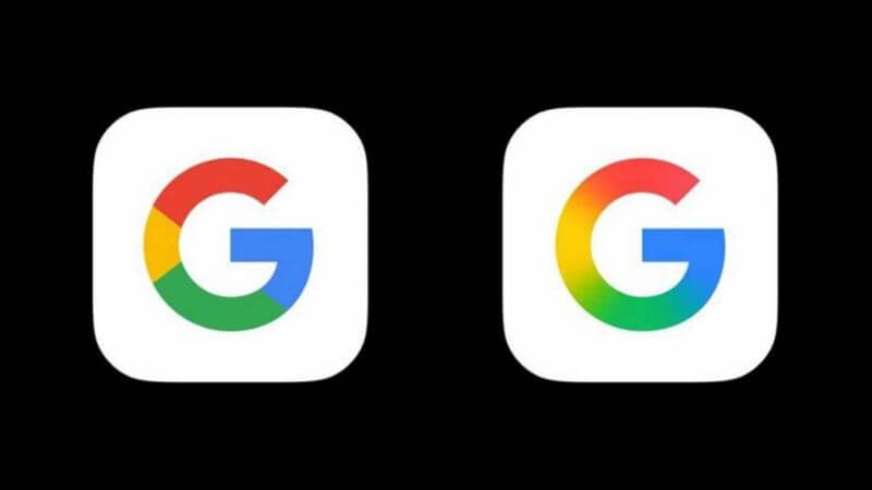
Google has updated its iconic G logo for the first time in almost a decade. While the new logo retains the G in the familiar Product Sans format, it significantly changes the color scheme.
What’s New About Google’s G Logo?

Google’s famous G logo has gotten a makeover for the first time since 2015. The new design keeps the same basic G shape we are all familiar with, but it makes a big change to how the colors look and flow together.
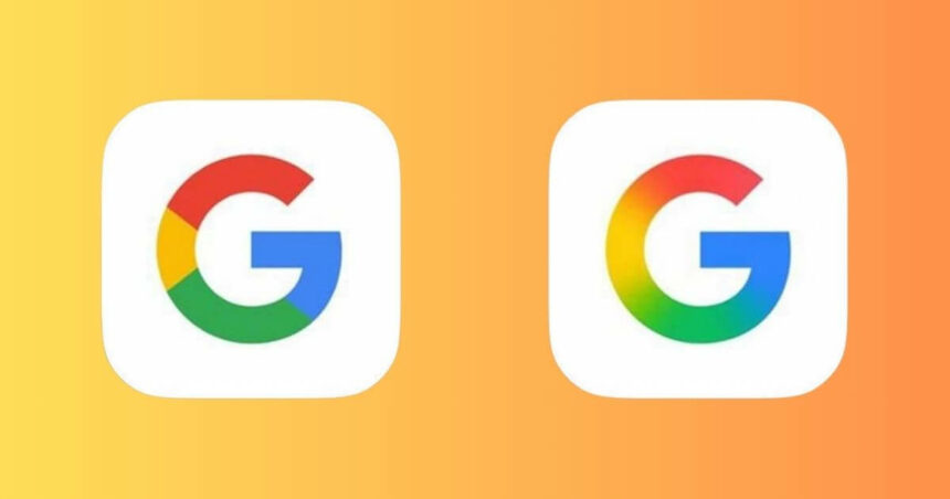
Earlier, Google’s logo had four distinct colors—red, yellow, green, and blue—each in its own separate section. The new version takes the same colors but blends them together in a smooth gradient. This creates a more modern, polished look with better depth and visual balance. The colors now flow into each other instead of being sharply divided.
Where Can You See The New G Logo?
Google began rolling out this updated logo on Sunday through an update to its iOS app. Android users can also spot the new design if they are using the Google 16.8 beta app, according to a report from 9to5Google.
So far, Google hasn’t announced whether this new color gradient approach will extend to the full six-letter “Google” logo or appear on other products. They also haven’t confirmed if other Google apps like Chrome, Maps, or Gmail will adopt this new look.
Why Change The G Logo Now?
While Google hasn’t officially explained the reason behind the update, the timing seems significant. The tech industry is currently going through a major transformation, with artificial intelligence becoming central to many products and services.
Google is rapidly integrating AI features across its entire ecosystem. Their Gemini chatbot has evolved considerably since its launch as a response to OpenAI ChatGPT. With the release of Gemini 2.5 Pro, Google has established itself as a leader in the AI space.
AI is now part of the Google Search product. Google Search provides an AI-generated overview of search results. Gmail, Calendar, Docs, Drive, Keep, and Tasks all feature Gemini-powered AI capabilities to help users work more efficiently.
Google’s logo refresh might be Google’s way of signalling a new era for the company, one where AI is central to their identity and offering. A visual update is often a company’s signal of a major strategic shift in its direction.
The Importance Of Brand Evolution
Google quietly shipped its new “G” logo after almost a DECADE. #Google #GLogo pic.twitter.com/ZehqsHNZr1
— Techotales (@techotales) May 14, 2025Major companies like Google need to occasionally refresh their visual identity to stay current while maintaining brand recognition. A successful logo update preserves what people love about a brand while introducing subtle improvements that reflect changing trends and company direction.
Google appears to be taking a colourful approach with this update, keeping the familiar G shape and colour palette while modernising how those elements interact. This maintains continuity while signalling that the company continues to evolve and innovate.
As AI becomes increasingly central to Google‘s product and business strategy, we may see additional visual changes that help establish Google‘s identity in this new era of technology. The updated logo might be just the first step in a broader refresh of Google’s visual identity across all its products and services.
Follow Us: Facebook | X | Instagram | YouTube | Pinterest


